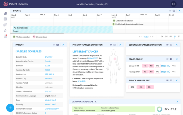
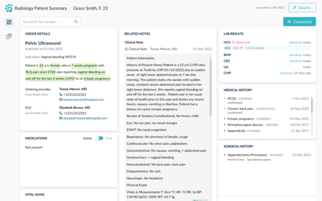
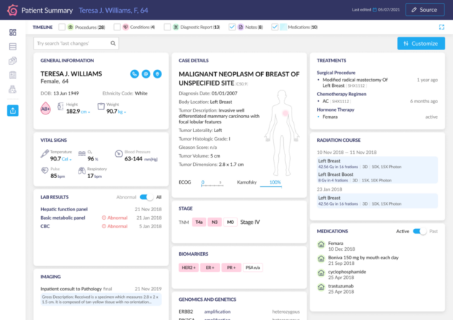
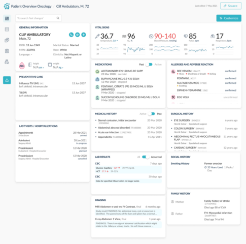
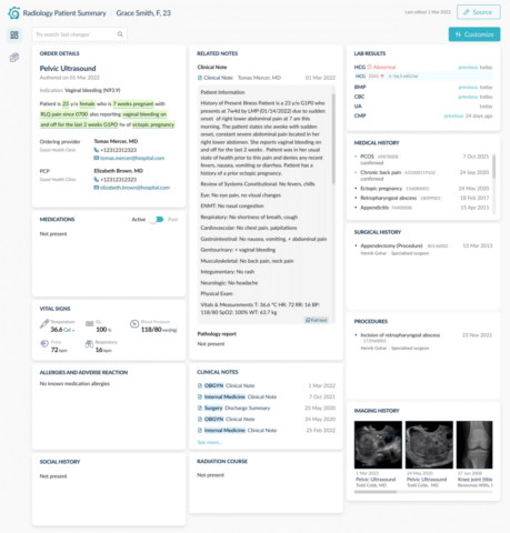
Patient Summary was created to ease Clinician’s burden. Using the power of AI, the application helps Doctors, Nurses and Researchers to quickly make sense out of hundreds of patient notes and documents, offers an insight into patient’s history, automates care-centered workflows, and generates patient visit notes — all with just a few clicks of a mouse — leading to better outcomes and more time spent with patients.
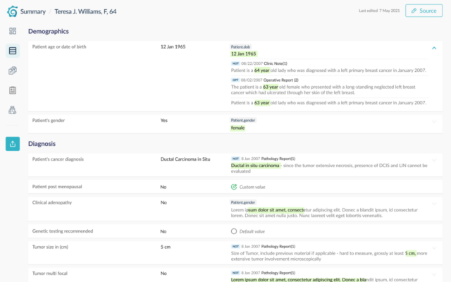
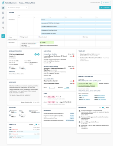
This product is closely related to Chart Abstraction. A dashboard for a doctor was conceived. This dashboard presents the work of an abstraction chart in a form that is easy to understand.
My contribution to this project is prototyping and UI.
Several prototypes were developed before implementation. The design kit also changed.
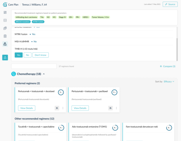
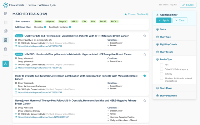
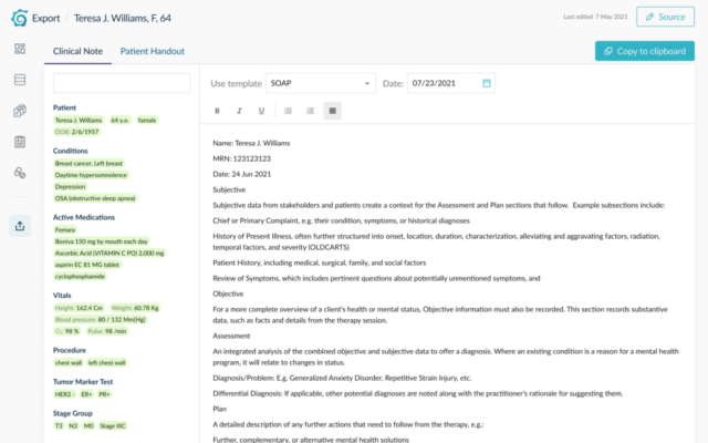
In addition to viewing documents and generating a report, additional sections appeared in the product — a section of recommendations, the selection of clinical trails. Built-in Clinical Decision Support and Clinical Trial Matching systems generate best practice patient care plan instructions, creating valuable insights for clinicians. The application pre-populates physician’s notes with the information extracted from the medical record.
The dashboard now is customizable. You can drag widgets around the grid. Plans for the future is to make customizable dashboards for different specialists. The dashbords for internist, oncologist and radiologist are already available .
I created this promo animation in Figma. I didn’t expect that it was possible, how cool Figma is. It was easier than Adobe Animate, but the timing was hard to set up.
Subtitles: The animation shows how, after a call from a patient, Chart Abstraction collects structured and unstructured data about the patient and then presents them on one usable Patient Summary screen. As a result, paperwork is reduced and the doctor has more time to communicate with the patient. And filling out a prefilled reportis quick and easy.


