My capstone project (speciality “Design of interaction”)
Links: view prototype, view demo video
The mobile app “Baby garage” is useful for saving the budget of young families, reusing resources and helping the community. Parents can share clothes, toys and other children’s things.
The idea of creating an app for the exchange of children’s goods didn’t come to me immediately. I wanted to create something unusual and interesting. There were ideas for creating an app to optimize the operation of queues, an app for fighting spontaneous purchases, an app that controls the emotional state and protects against anxiety and asthenic disorders.

But after communicating with friends, I was inspired by the ideas of bringing order in life (Thanks to Marie Kondo and her book “The Life-Changing Magic of Tidying Up”) and searching for re-use of resources. I have many friends who are the young mothers. And the eternal problem of young mothers - they bought for her baby something but the baby grew up in a month. It is a pity to throw out the good thing and a new one is needed.
I studied apps for the exchange /resale of children’s things, but I did not find any specialized apps for residents of Russia. There are a lot of apps where you can give away/ sell out anything. There are forums of mothers, but unfortunately, the search for a specific thing is difficult, you just need to constantly monitor the new branches of the forum. I investigated the needs of Russians. And yes, I didn’t manage to think globally.
And so the main features of my app:
- Convenience of search
- Ease of tracking updates
- The ability to get rid of their items.
At first, I had the idea to make a detailed profile where parents could specify the parameters of the children (size, height, chest girth). You don’t need to adjust the filter every time and the search immediately follows the parameters of the child. But it also turned out to be uncomfortable, children grow fast. So I rejected this idea.
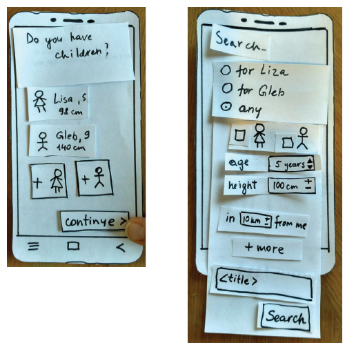
detaled profile and the search
I thought in the app people could sell things and donate part of the income to charity. But as the survey showed, many mothers didn’t want to value things or doubt the correctness of the assessment. It is easier to give a thing without assigning a price to it.
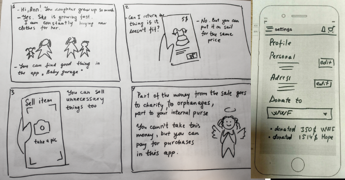
charity idea
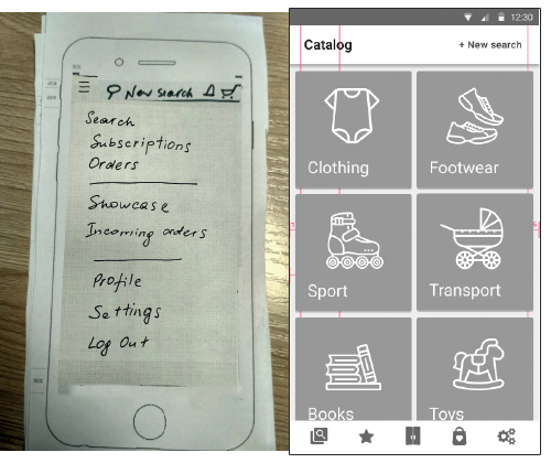
hamburger-menu, bottom nav bar
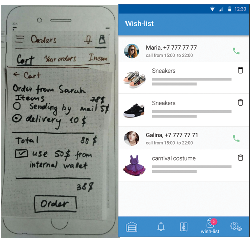
wish-list instead of cart and orders
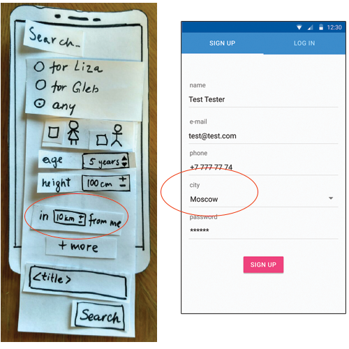
“search with geolocation” vs “profile settings”
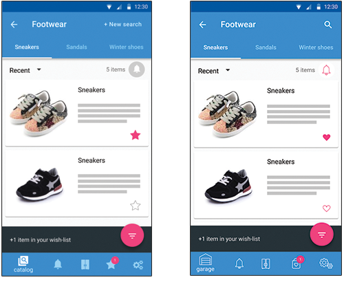
“stars” vs “hearts”
Here is the prototype of the app. I didn’t make the final design mockup, which could be given to work. But the users who tested my prototype noted the simplicity and transparency of navigation. And they said that they will use it as soon as I create it)
Well, I couldn’t create something innovative. I created a convenient prototype of the app that people would like to use.
Many thanks to everyone who helped me in the process of working on this project.